Whalefall UI
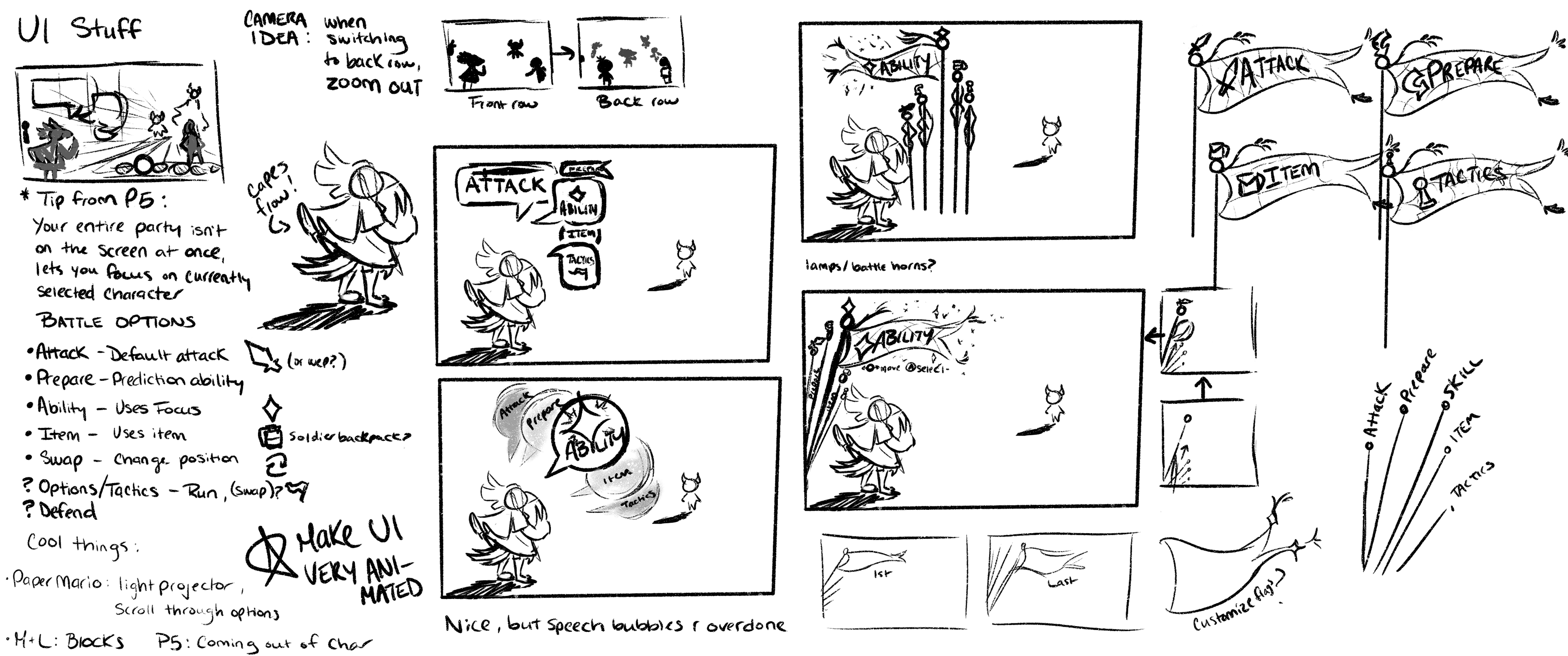
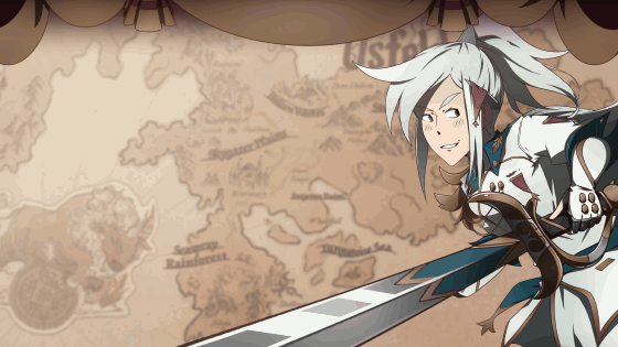
For a game centered on a fantasy war but not in like, a gritty way, I wanted the UI to reflect the game's charming personality with motifs like scrolls and war banners. As a fan of Persona 5's lively menus, I strived to achieve something similar with animated flags during battles and an expressive main character in the pause menu.
Role: Art Director
UI Team: Me, Ashli Hudson, Atley Sakamoto, Giulia Biazus
Studio
Whitethorn Games
Whitethorn Games
Genre
JRPG / SRPG / Visual Novel
Platforms
PC, Consoles (Unreleased)
JRPG / SRPG / Visual Novel
Platforms
PC, Consoles (Unreleased)
Website
Steam Page
Steam Page
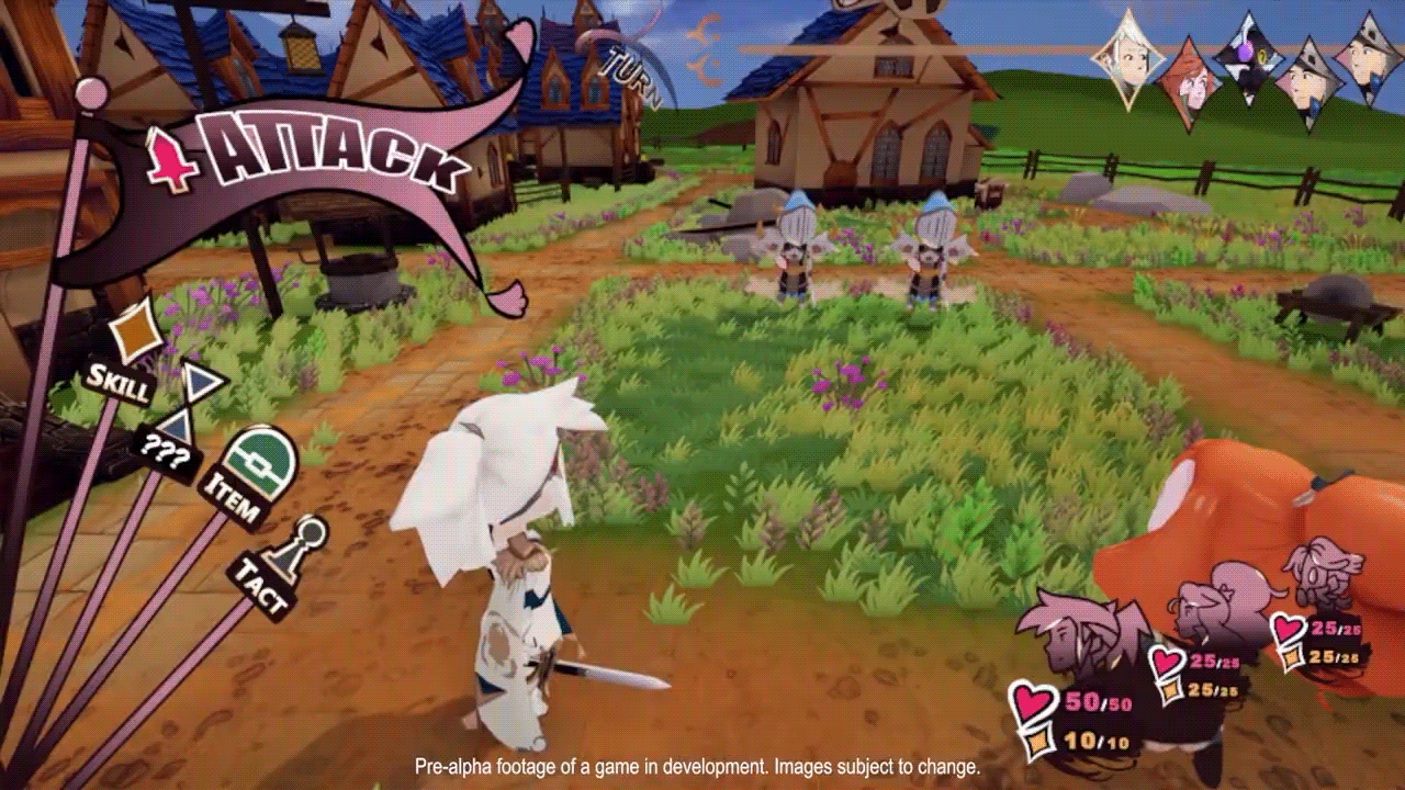
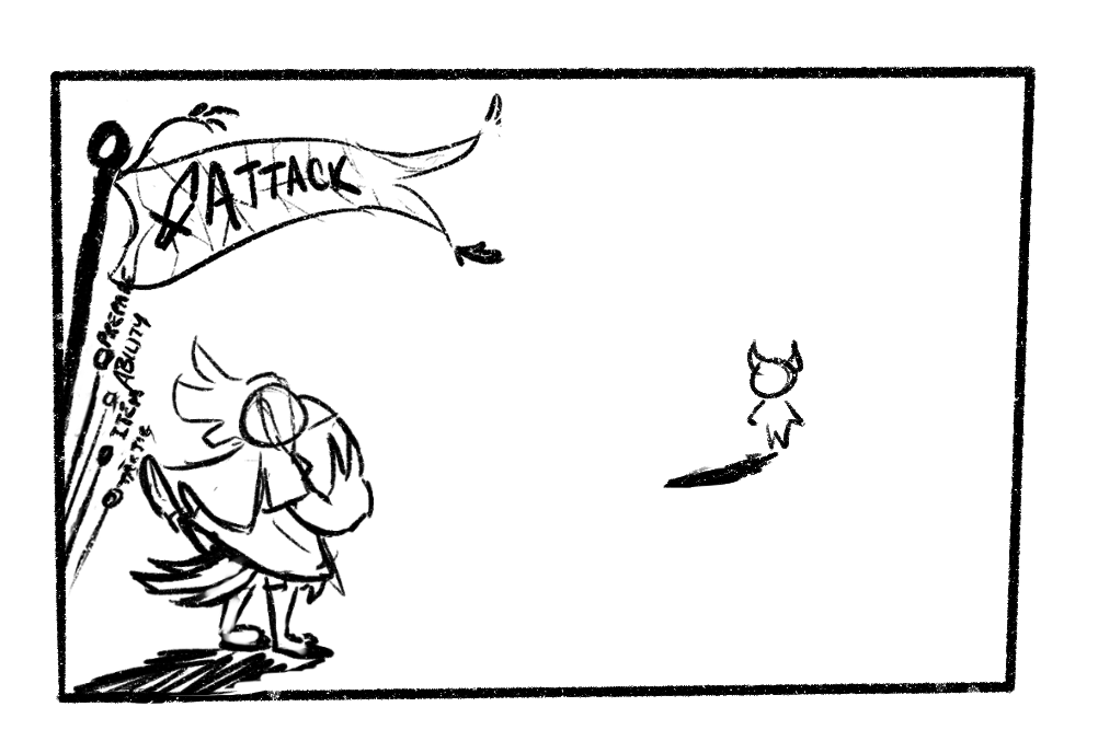
Battle UI


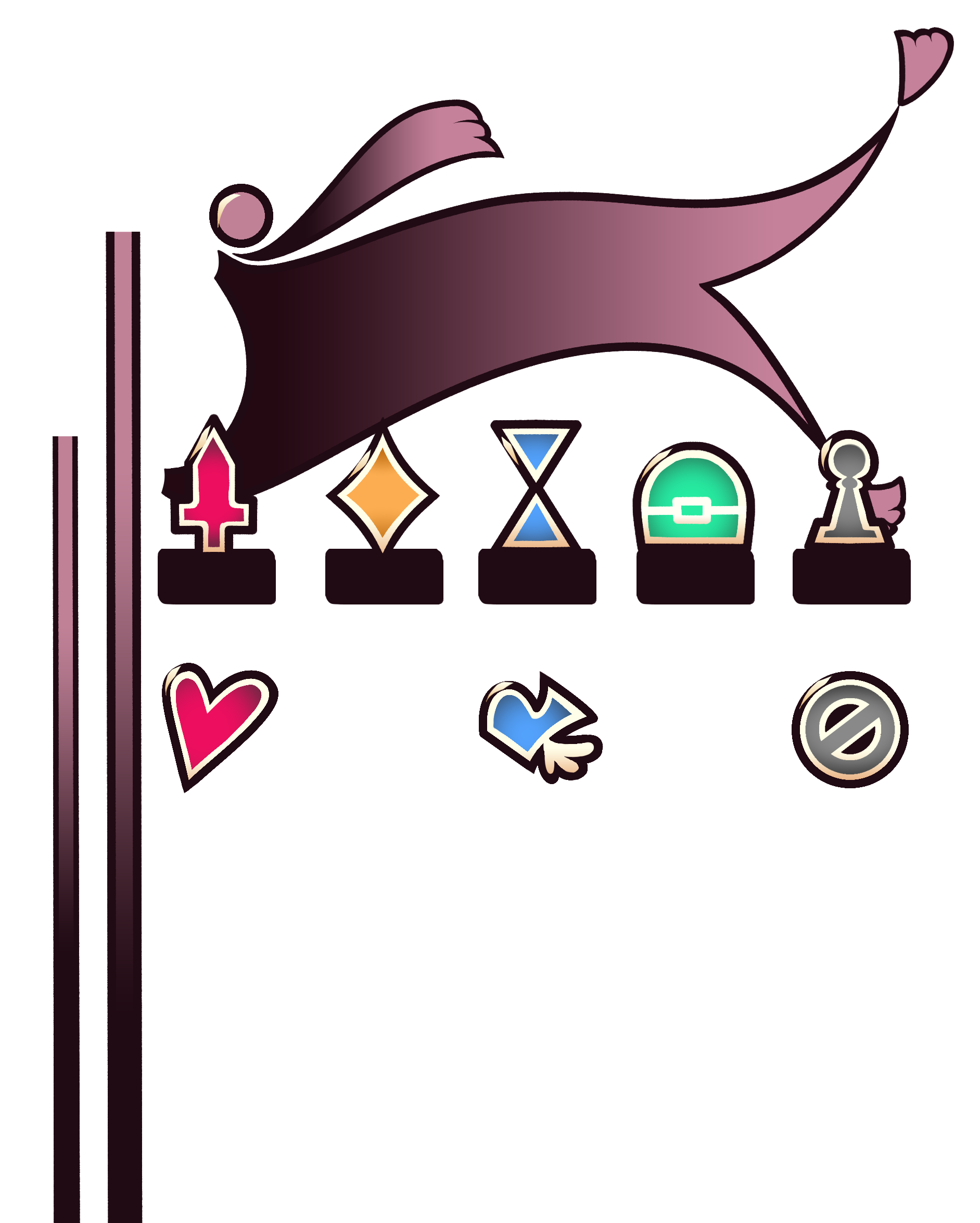
Battle Flag Assets
Illustration by me, Animation by me and Ashli Hudson
Battle UI Concepts
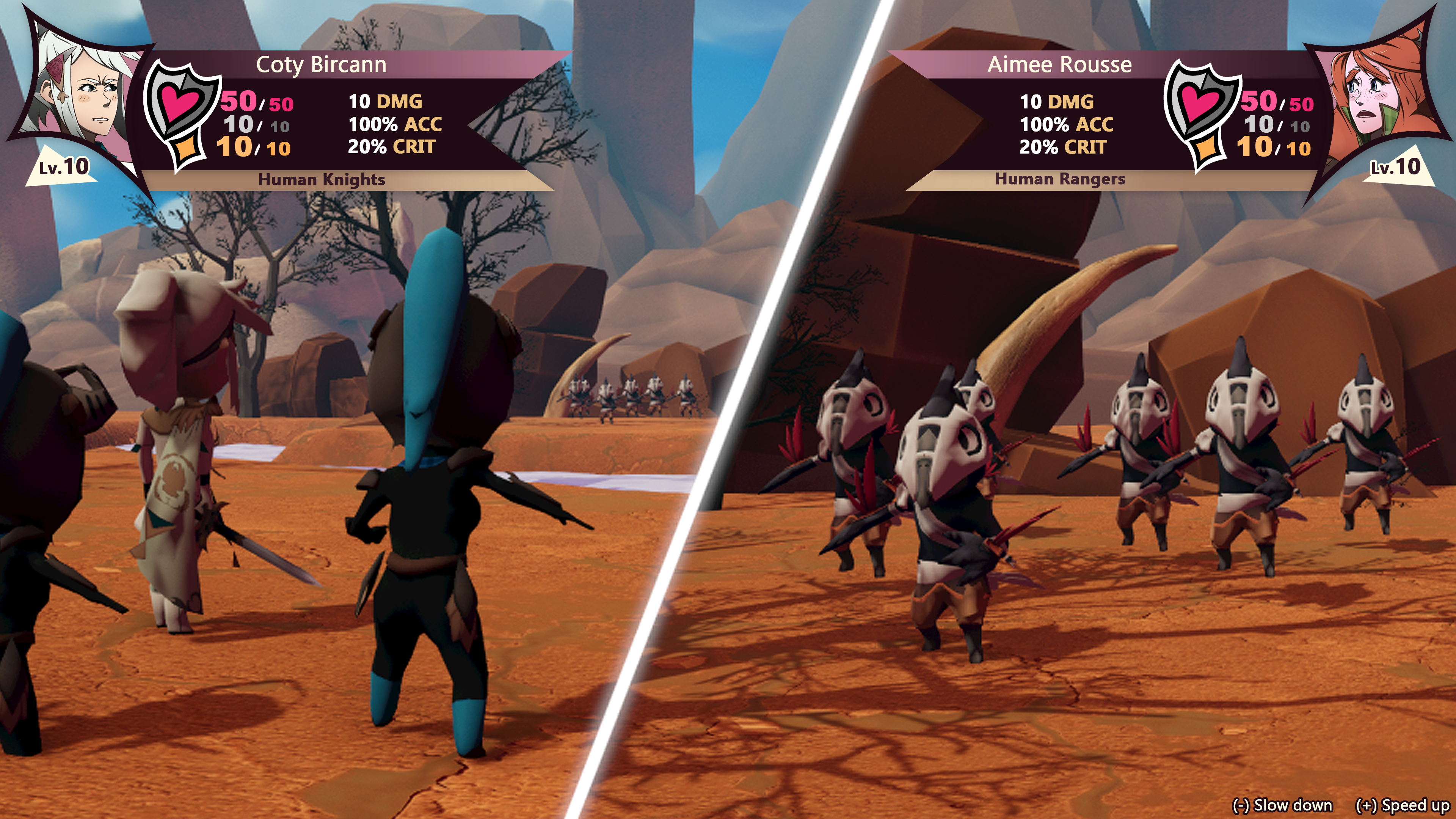
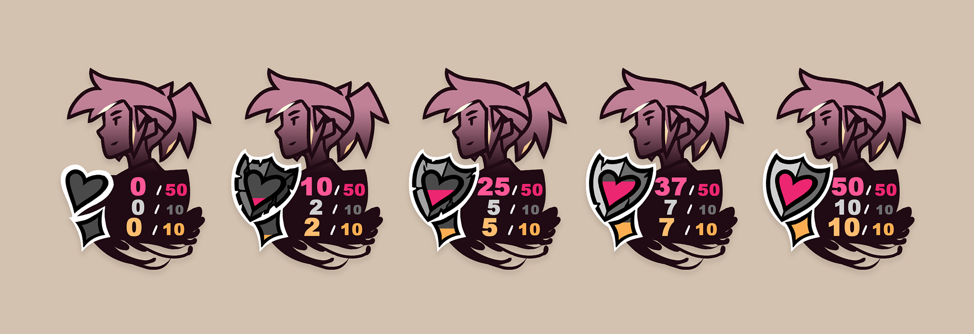
Health Bar Portraits
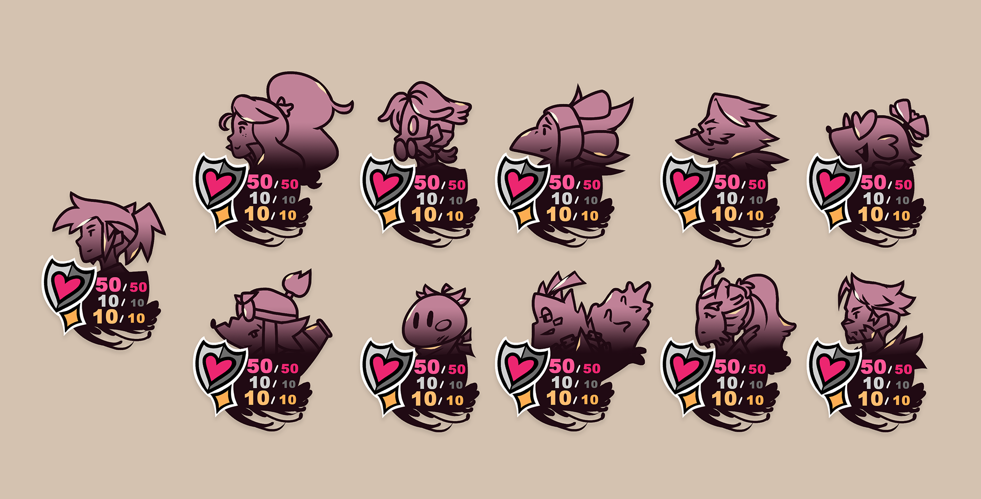
Health and Armor Progression:
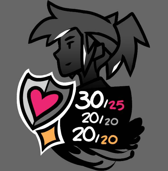
Armor Break
Animation by me and Ashli Hudson
Turn Order
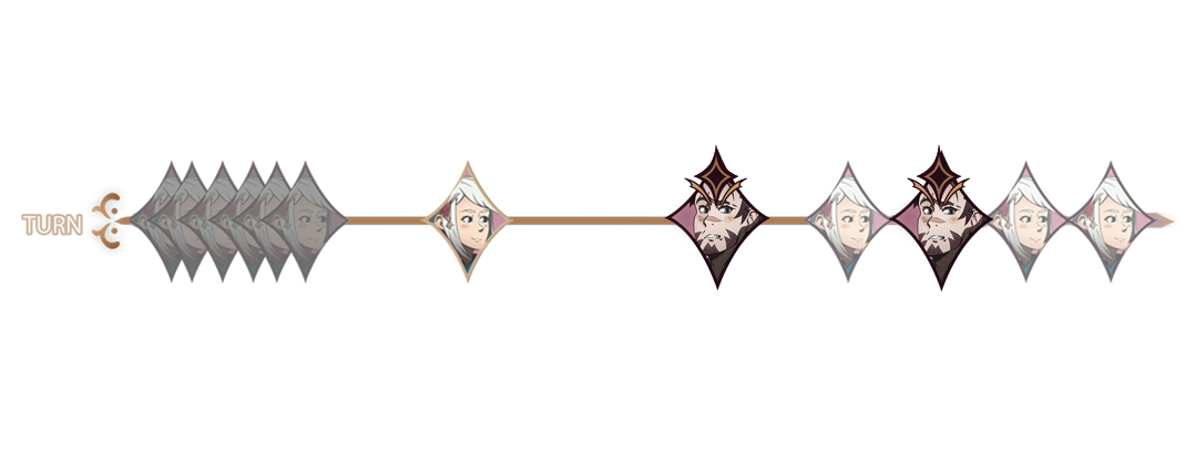

UX Challenge & Solution
Readability is key, and the player needs to be able to easily read the turn order to get information on when characters will take their turns. We didn't want to rely on color-coding blue for allies and red for enemies, as not only is it easy to miss but colorblind players wouldn't notice a difference at all. I made the Enemy Marker symbol to clearly mark where each enemy is in the turn order. Enemies are also more opaque and facing the opposite direction from player characters.
Damage Numbers

Critical Hit
Status Effect Icons
Design by me, Animation by me and Ashli Hudson


Enemy Targeting Concepts

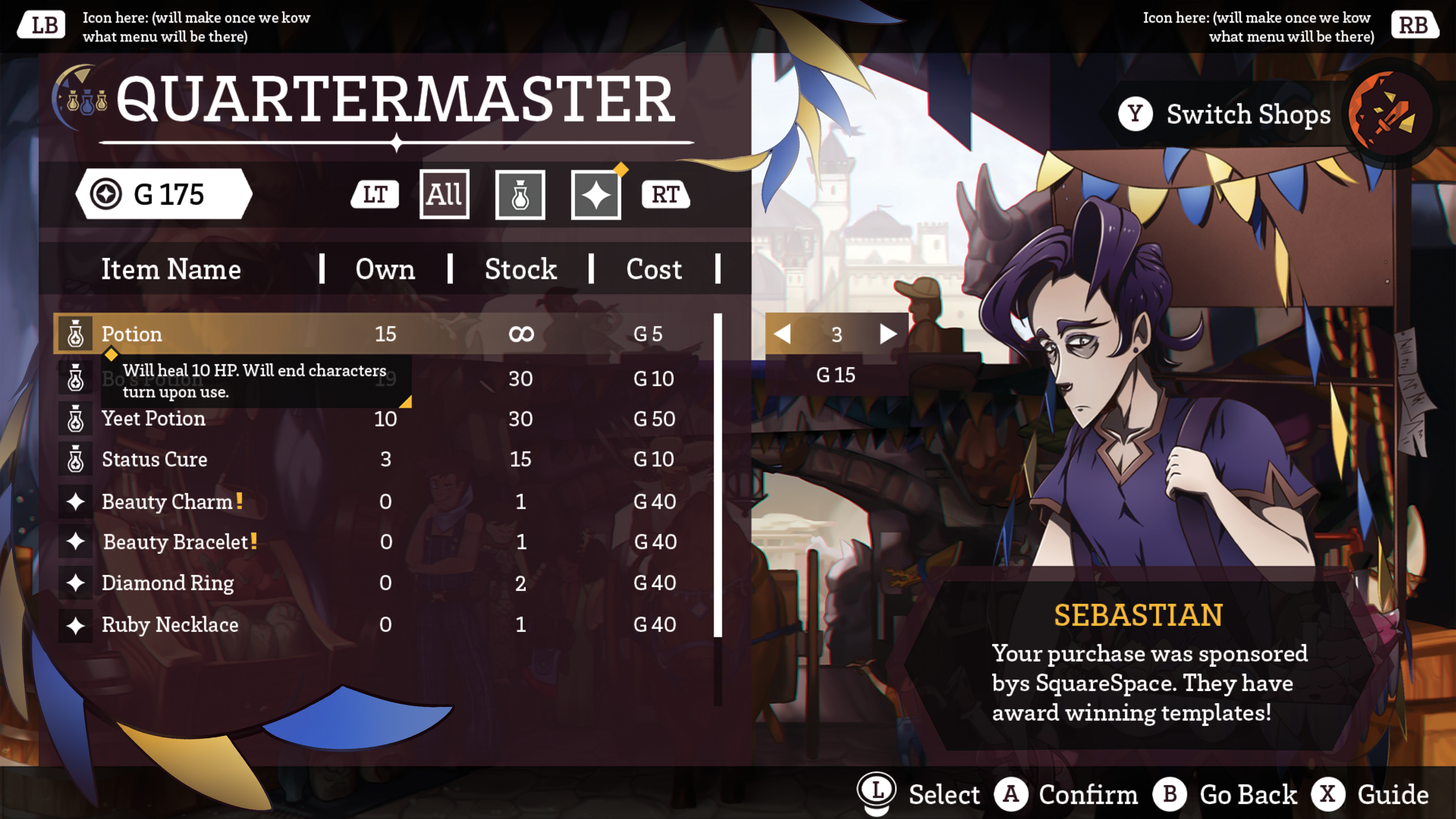
Shop UI
By me, Atley Sakamoto, and Ashli Hudson
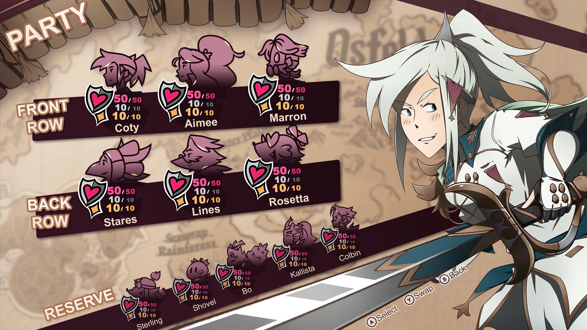
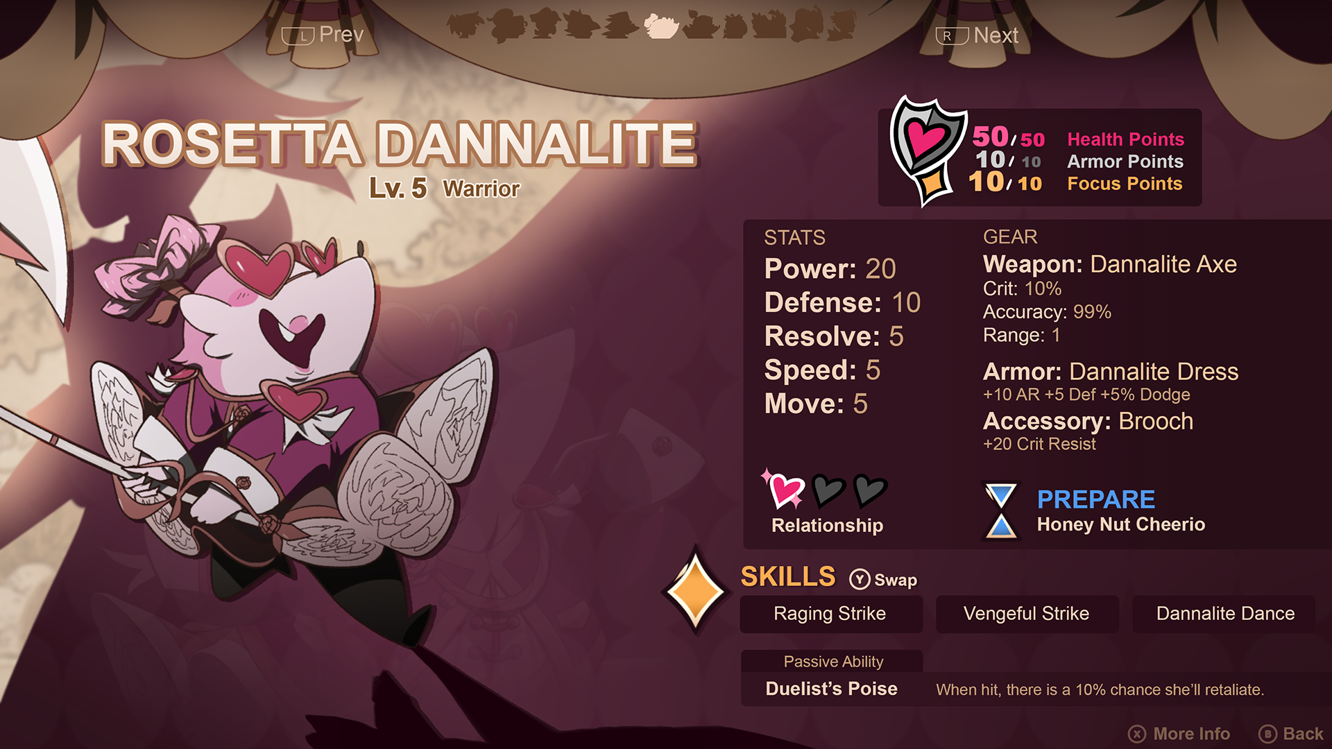
Pause Menu
Pause Menu Screen Transitions
Illustrations by me, Animation by me and Ashli Hudson

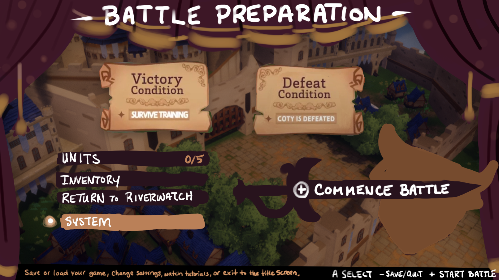
Preparation Screen Concept
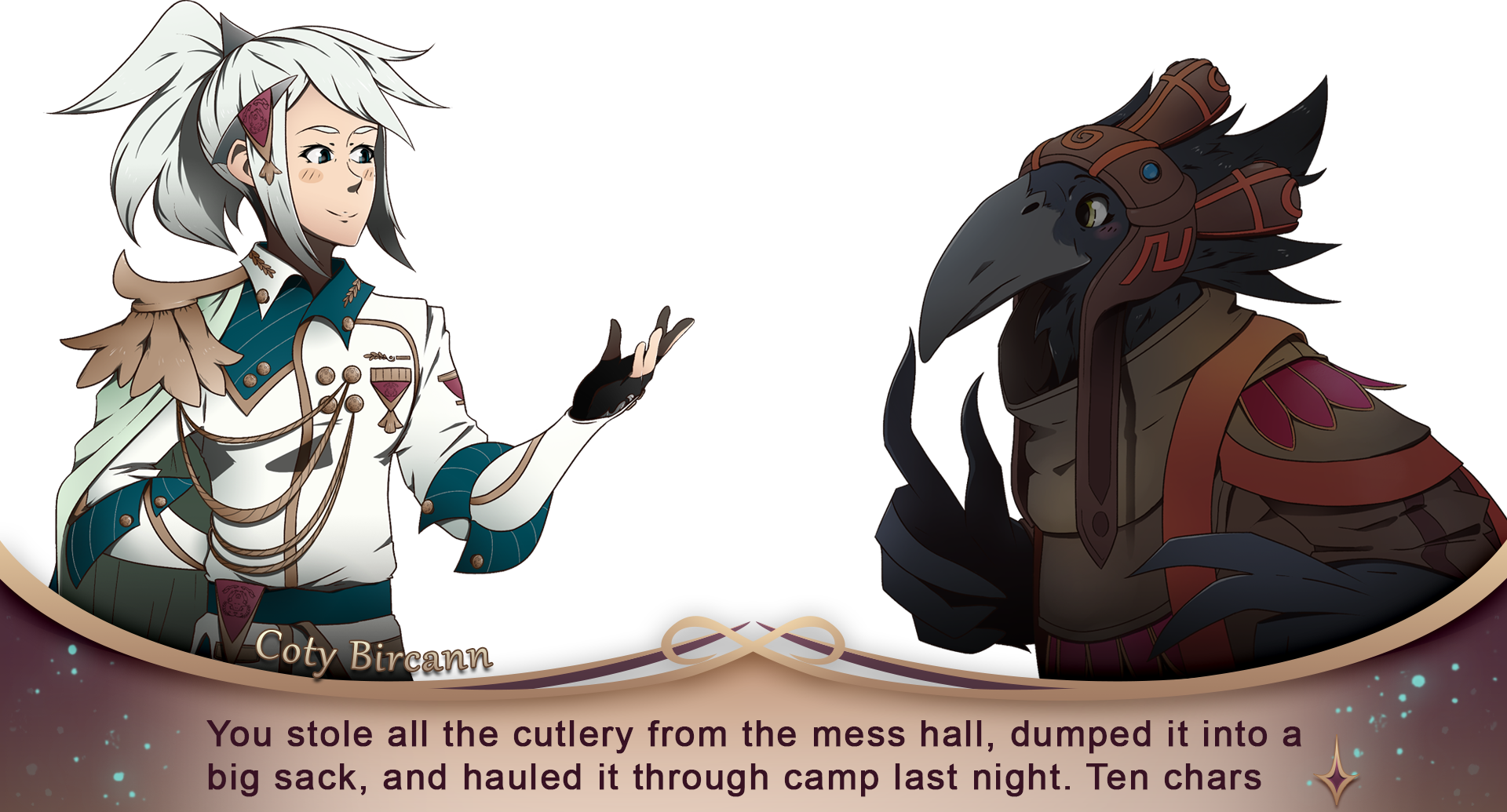
Dialogue UI